UX - UI - medical place.
As part of my apprenticeship at Medical Place, I had the pleasure of creating numerous screens. Medical Place is a company that connects medical equipment suppliers with doctors. Here are some before/after examples to give you an idea of my work:
Primary Audit
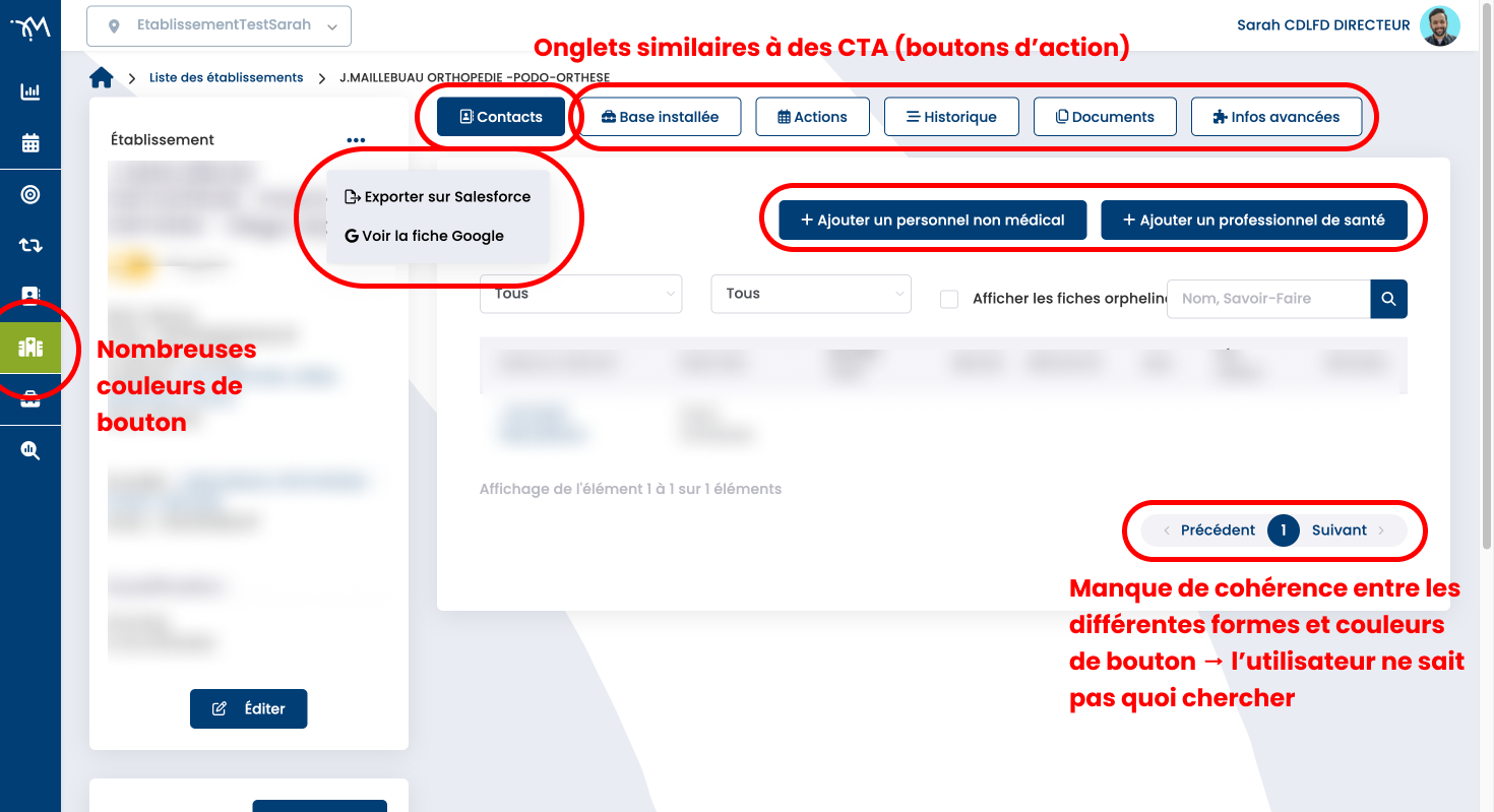
Upon my arrival at Medical Place, I conducted an audit. This audit allowed me to identify several issues, which I addressed progressively as I worked on each screen.
Above is an example of a problem identified: Too many different types of buttons, not standardized. There's a lack of consistency and prioritization; the user doesn't know where to look to perform an action. Some tabs look the same as buttons, even though their intended function is different (a button is generally used to validate or confirm an action, while a tab allows navigation between two sub-sections of a page)...
Redesign of a "search engine" page
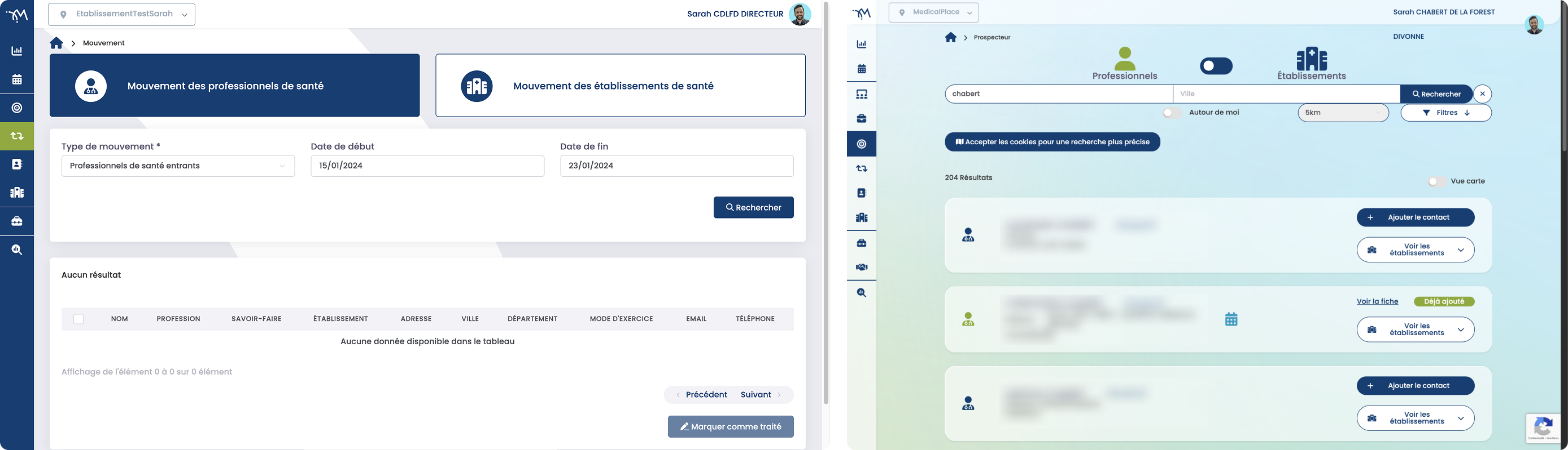
The application's main page could be improved. Some elements (buttons and filters) took up far too much screen space compared to the search results. Furthermore, our users needed more flexible search options. Therefore, I proposed a search bar with retractable filters and other smaller elements.
After several proposals, this version was chosen as a temporary measure while we wait for the implementation of a keyword search system (which is simpler for the user).
Redesign of a "complex technical specifications" page
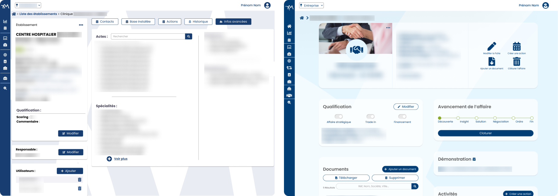
Redesigning the technical specifications was a challenge, as there was a lot of information to display. Overall, our users reported complexity, so the goal was to simplify things for the user. We therefore modified the summary section, adding visuals for easier navigation. We increased white space to reduce the feeling of being overwhelmed by too much information. The content of the different tabs was consolidated onto a single page. Important information was placed at the top, in a hierarchical order. Results: Fewer clicks to access content, improved visual clarity, and simplified visuals and navigation.
Work on the user journey
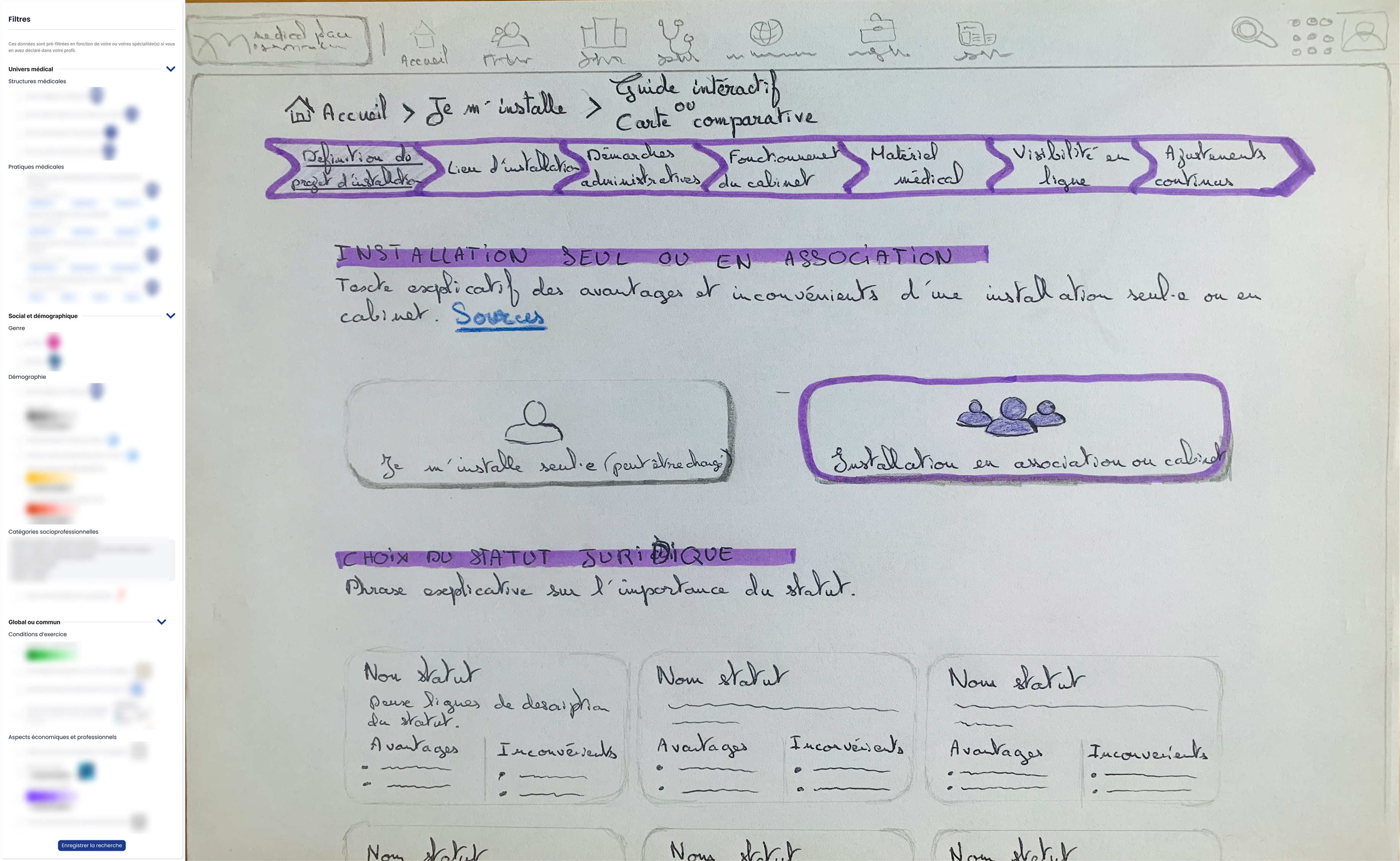
This section illustrates more in-depth UX research for the development of a module. This module, "Setting Up," aims to facilitate the setup process for healthcare professionals. A first version was quickly created, but I had the opportunity to further develop this module during my final-year thesis.
If you would like to learn more, a simplified version is available here.
Above, on the left, is the list of filters to display on a map to view and compare different criteria. On the right is a wireframe showing how to support the professional throughout their project from start to finish, guided by a wizard (a timeline-like line indicating all the steps to follow).